

Open Space
Client
Public Libraries
Project Length
6 Weeks -
6 Total Sprints
Tools
Axure RP, Sketch, Xtensio, Miro (Formerly RealtimeBoard), Optimal Workshop
Deliverables
User Persona, Task Flows, Application Map, Final Prototype, Annotated Wireframes
Overview
In a mock-client simulation project, I worked with a team of three other designers to design a product for public libraries to increase engagement with their communities. Through research, synthesis, define, design, and test, we created a digital solution in the form of a native mobile iOS application allowing the public to book space within libraries.
Project Background & Brief
More Than Just Books
When most people think of a library, they think of books and maybe video rentals. Approaching this project, my personal perception of the public library was that of an outdated, unpatronized institution being replaced by digital media, which allows people access to this entertainment without having to leave the couch. However, as my team and I learned through our research, this was not the case.
The Mission
Our challenge was creating a product that creatively strengthens the relationship between the libraries and their communities.
Empathize
Research Approach
After some initial domain research, we found some of the following insights that proved our assumptions to be false:
With this new information, we set out some goals for our research:
What are the current pain points of the library?
What is the library currently doing to serve the community?
How can the library better serve the community?
Why are people going to libraries, and what are they gaining?
What does the library do well and not so well?
What are alternatives to the library?
What are the barriers to using the library?
What current digital products are being used in the library?
Talking to People
We spoke to two subject matter experts (SME) and six users to answer these questions. Here’s who they were:
Insights from Interviews
Here are the key insights we collected:
Users are enthusiastic about the library
“I love every library I’ve ever been to...If I stayed somewhere...I wind up spending some time [at] their library.” - Sarah, User
Users enjoy library events
“We love [the library] because they do a ton of community events…” - Ashley, User
The library is not just for books and DVDs
“...we are adding memory kitchen caregiver kits...we have Kindles...mobile hotspots...museum passes…” - Meghan, SME
Users see library space as a key resource
“I find that good place to work and no distractions that you sometimes my have at home.” - Bruce, User
Users are frustrated at the lack of space
“...it may not be quiet by some people standards, because a lot of the high school students getting in there…” - Bruce, User
Competitive Analysis
We completed a diverse competitive analysis of companies that offered similar services as public libraries.

From this analysis, we took away the following insights:
All have mobile apps
Simplicity makes it easier to navigate
Intuitive organization of information
Business services and products are clear and straightforward
Search functionalities are intuitive, with suggestions and recommendations as well as advanced search parameters and filters
Curated lists provide direction and suggestions for new users
Synthesis of Research Insights
We did an affinity map to organize and synthesize all of the insights we gained from this research.

After some discussion, we decided our three biggest takeaways were the following from the activity as they had the most potential to evolve into a solution:
Define
Defining the User
Based on the affinity map, we found similar patterns between our users that helped us create two user personas. Please allow me to introduce Joseph:
Next, allow me to introduce Janet:
Defining the Problem
Knowing who we were solving a problem for (Janet and Joseph), we knew it was time to define it. We then defined the problem as:
The workspace seeking library member needs a guaranteed area because they want to ease any uncertainty of seeing the library facilities fully booked.
Guiding the Design
Now that we defined the problem, we created design principles to help guide and evaluate our designs. They were:

Laying Out the User’s Journey
To help layout Janet and Joseph’s typical experiences with the library we laid out user journey maps.


Ideate
Forming Ideas
Having a clear picture of the problem we were solving and who we were designing for, we started getting our ideas for solutions down on paper. For this project, we did multiple rounds of 6-8-5 sketching. We each generated multiple ideas for how to solve our problem statement for Joseph and Janet.
When we shared them with the group, we all had variations of a mobile application allowing the user to reserve space at the library. Since Joseph and Janet are both on-the-go individuals and active mobile phone users, we decided the best approach for our solution was a mobile application allowing users to reserve space ahead of time at their local library.
Flow of the User
With our solution starting to take shape, we needed to focus on what information we needed to house and the way to organize it. We constructed two interconnected task flows using Joseph and Janet’s journey maps for how our solution would fit into their lives. This helped us to visualize their mental models and how they would interact with a digital system.

Dealing Out the Cards
We performed a card sort activity with users to understand how users would expect to find information organized and connected within the application. We compiled 30 cards containing aspects from our research we believed would be parts of our solution and administered an open card sort, asking users to sort these cards into categories and name them as they saw fit. Below is the resulting similarity matrix from the activity:
In hindsight, we all agreed that we would go deeper with the terms for future card sorts to provide more insight into the results.
Being a Cartographer of Applications
Using the task flow and the results of the card sort, as well as our understanding of the users’ mental models we gained from our research, we created the following application map.

Further Ideation
Low-Tech Testing
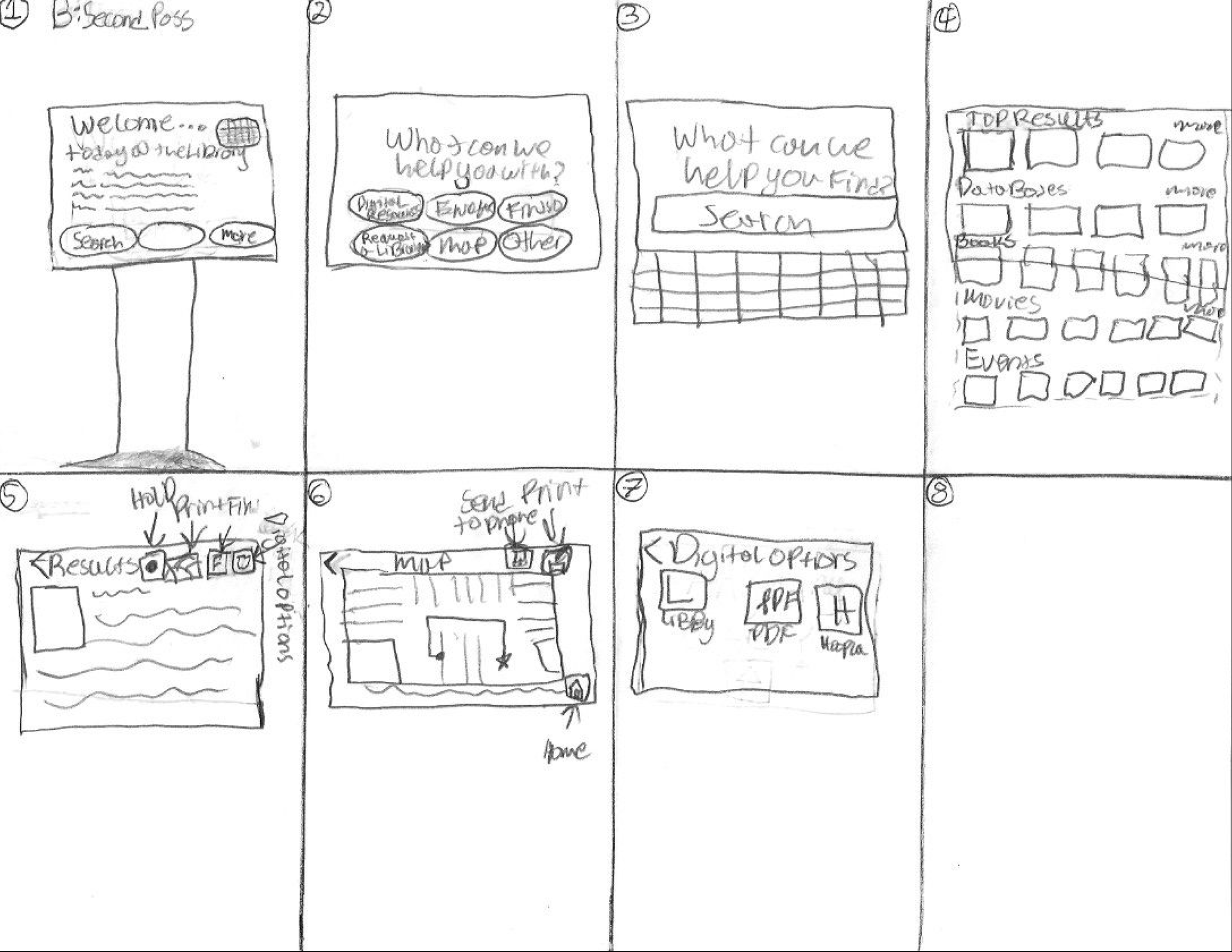
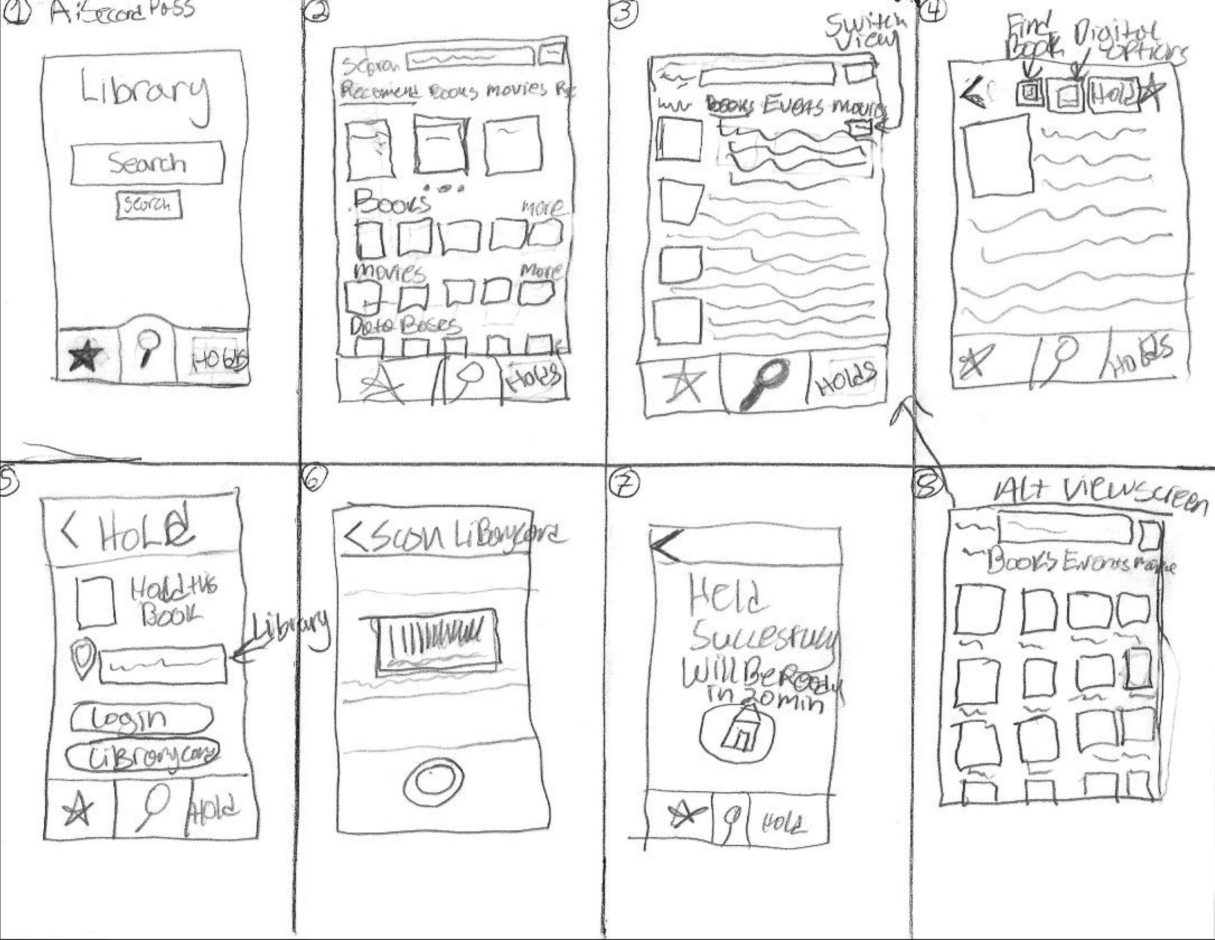
Now that we understood the site's organization, we began to lay out each page’s structure. To validate our initial assumptions about how to structure the pages, we created paper prototypes of the pages in our application map to show to a potential user and gain their feedback. Here is my prototype as shown to the users:
Here is the feedback I received on this prototype and the changes I made based on said feedback:
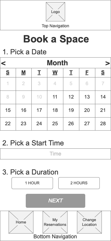
On the Pick a Time/Date screen, she would have liked to have an actual calendar to choose a date from.
I made this change in the iteration, placing a calendar showing a full month on it.
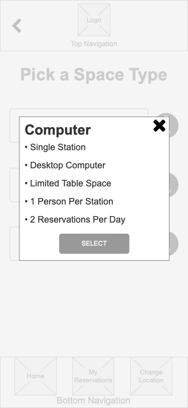
When she reached the Pick a Room Type screen, she noted that she was confused by how I had named the different buttons and that she would have liked to know more about what each room type offered. She also commented that she was confused because the page's name included the word Rooms and not all of them were rooms.
Based on this feedback, I removed one of the room types and streamlined the names of the room types. I also added an information button for each type to take the user to another screen that shows them more information on each room type. Finally, I changed the page's name to Pick a Space Type.
The subject commented that she liked the hamburger menu to be able to navigate to the main sections of the app.
Here is the resulting iteration of the prototype I made based on the feedback:
Framing the Wireframes
Now, having validated and adjusted our assumptions based on the paper prototype testing, we began to create our digital wireframes using Axure RP. To create uniformity within the screens each member was building, we built a style guide that contained all the necessary components to create wireframes.


Adding Interactions
We all added the necessary interactions to connect the different screens we laid out in our application map. Here is the prototype I created:
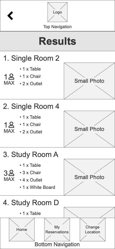
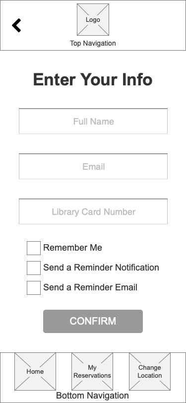
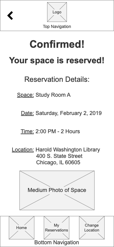
Testing & Results
We created nine tasks for usability testing of the prototype. We each tested one another’s prototypes to remove any bias. Here is the feedback I received from the test:
7.6/10 Net Promoter Score
Difficulty interacting with the onboarding process for older users
Difficulty with text entry into form fields
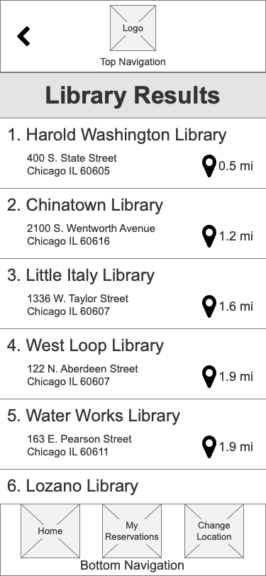
Difficulty knowing where spaces were within the library
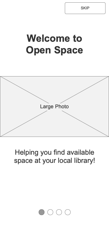
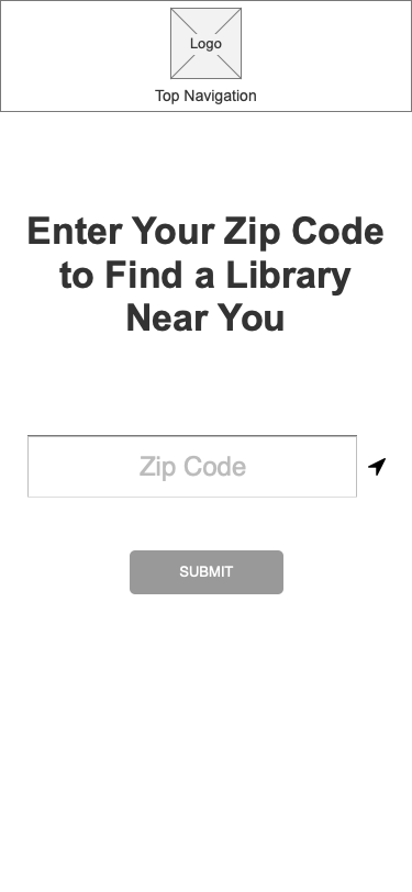
Final Prototype
Based on the feedback received in the usability test, we chose the prototype that resonated most with users, made the necessary improvements, and presented it as our final product. This was our final product, which we called Open Space:
Future Considerations & Recommendations
As for the future of Open Space, we suggested that our mid-fidelity wireframes and prototype get passed off to user interface designers to create a high-fidelity prototype. Additionally, content strategy and marketing teams should be involved in developing content and brand strategy. Finally, additional usability testing should be conducted to ensure we continue to create an application that solves the user’s problems.